With an embeded .swf file and some simple edits to your html, you can add a fullscreen toggle to your dashboard.
Tested in the latest versions of IE, Firefox, Chrome and Safari (Button does not return from fullscreen, use Escape Key)
With an embeded .swf file and some simple edits to your html, you can add a fullscreen toggle to your dashboard.
Tested in the latest versions of IE, Firefox, Chrome and Safari (Button does not return from fullscreen, use Escape Key)
Are you ready to mix it up and create your own theme? Well you can easily break exisiting themes apart into two sections (charts vs. art) and mix and match those components into new themes.
My own custom theme combines Nova art (selectors, icons, etc.) with iTheme charts. I personally liked the simplicity of the iTheme graphs, but greatly disliked the format of all of the other components in that theme.

In this session, Mike and Mico will share some of the techniques you can use to speed up your sluggish dashboard solutions.
Learn “How To”:
Who is presenting?
Mike Alexander | Mico Yuk
How to Register?
Click here
As you begin to develop sophisticated and complex dashboards, you will inevitably be faced with the need for more screen real estate to display more information. One easy way to solve this issue is by layering components and displaying the data dynamically when certain conditions are met. This methodology can become quite complicated as the number of components in your dashboards increase and are shared for multiple tasks. It’s not uncommon for data-rich dashboards to contain several hundred components.
In these cases, it is essential that your dashboards include the following:
In this post, I’ll discuss some of the strategies that I’ve used to solve these types of issues making your dashboards easier to support, manage and update. Dynamic layering will also enable you to produce very powerful Xcelsius (uh, um…) “SAP BusinessObjects Dashboards†dashboards.
Dynamic Visibility
Let’s begin by focusing on one of the most basic yet extremely important tasks in a multi-layered dashboard – Dynamic Visibility. Reminiscent of the good ole Show/Hide functions in VB, this property allows dashboard developers to dynamically present charts, selectors, maps, or any other component to users based on the presence of certain values. This feature can also be considered “conditional visibility†since components are displayed only when the contents of a cell matches the value bound to the associated key.
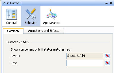
In other words, Dynamic Visibility works by binding to a cell where the values are designed to change – known in the component property section as the “Statusâ€. The “Status†property goes hand-in-hand with the bind-able “Key†property. The “Key†is the value that the component is “watching†for. Once the “Status†and the “Key†values are matching, the component will be displayed. It’s that simple.Â
The Status property and Key property can both contain hardcoded values, can be bound to formulas in the spreadsheet, or most commonly – bound to cells in a spreadsheet that also happen to be the “Destination Cells†of other selector or drill-enabled components.
The screenshot below shows the Dynamic Visibility property as it appears in every Xcelsius component.

Dynamic Visibility with the Canvas Container
Since Dynamic Visibility is available for every component, using it with the Canvas Container can do wonders for easing layering complexity. Instead of assigning a Dynamic Visibility Status and Key for practically EVERY layered component in a dashboard, use the Canvas Container as your layers and just assign Dynamic Visibility to them.
You may encounter situations where you’ll also need to add Dynamic Visibility to components within a single Canvas. Without the aid of the Canvas Container, this functionality would require very intricate Excel formulas with multiple IFs, ANDs, ORs, etc. in order to produce the needed result.
When to Use the Canvas Container
Dashboard design always starts out easy – just add a couple text labels, a few charts, a couple selectors, then bind the components to data in the spreadsheet. Then the next thing you know, you have 47 components; then after a while, 147 components. But before you reach that point, hopefully you’ve asked yourself the following questions:
Another useful component for producing robust dashboards is the Tab Set component. This was one of my favorite components until the Canvas Container and Push Button components were introduces. The most extensive dashboards will likely contain a combination of both the Tab Set and Canvas Container layering components. The Label Based Menu is also a great component for providing the functionality of a Tab Set but without the bulkiness.
Displaying the Canvas Container dynamically is easily done in combination with the Destination Cell of these popular components (plus many others):
How to Add Components to the Canvas Container
Just drop the Canvas Container onto your dashboard canvas then drag and drop objects onto the component. The Canvas Container then acts as a “parent component” to all of the charts, selectors, labels, etc. that have been placed on it’s Canvas. You can also use the Object Browser to drag and drop objects onto the Canvas Container.
Note:
Be sure to set the size of the Canvas Container to the ideal proportions before adding components (charts, selectors, text labels, etc.) onto it. The placement of “child components” may change if the size of the Canvas Container is modified. It can definitely be done, it’s just a bit tricky.
Push Button – The Premier Companion to the Canvas Container
I’ve found that a natural companion component to the Canvas Container is the Push Button component. I cannot say enough good things about this most excellent component. Used merely to pass flags (1, 0, A, B, etc.), a touch of creativity can accomplish countless objectives. The Push Button component can fill-in gaps by masquerading as a hyperlink, serve as a close button or “Xâ€, provide custom deep-links, produce dynamic and drillable text labels, or even provide an invisible action button layered on top of a portion of a photo.
Groups vs. the Canvas Container
Component groups are created by selecting two or more components, right-clicking, then selecting Group. This allows the entire group of components to be locked in as a single group rather than individually. You can still modify the properties of individual components but you’ll need to expand the group in the Object Browser to select an individual component group member.
Note: Dynamic Visibility will need to be setup on every component within a group. In most cases, you can select all individual components within a group then assign the Status and Key values to all the components at the same time.
As previously discussed in the post, the Canvas Container acts as a type of group. Component groups can also exist within a Canvas Container in addition to individually.
Attached is a link to the XLF and SWF that make use of the Canvas Container and Push Button component. Feel free to download the compressed file and examine the properties of the components. Notice how the components appear in the Object Browser. Please let me know if you have any questions.
Dynamic Visibility – Compressed File
Thank you – Jim.Brogden@daugherty.com
Do you need to display stock information in an interactive SAP BusinessObjects Dashboard model? This post shows how to do just that. With as little as two components – the Candlestick Chart and a List Box – you can create and deliver an hour-by-hour and interactive display of stock performance for a selected day.
Download the full-screen version, XLF file, and sample data at the bottom of the post.
It’s customary for stock data to come in a very consistent format. This is good news for Xcelsius and Dashboard designers. Data can be inserted, linked, connected, and bound to your visual components with relative simplicity. Stock data is traditionally available with the following columns:
In this post, we’ll create a dashboard by taking the following steps:
Stock and commodity trading specialists can analyze the patterns created by a Candlestick chart to make crucial decisions about which products to buy/sell and when to buy/sell them. Patterns in a Candlestick chart can illustrate bullish and bearish trends, trend reversals, indecision of traders, complex stick patterns, and much more. Day traders and long-haul investors alike can employ the centuries old practice of Japanese Candlestick Charting and interpret data patterns in Xcelsius to identify marubozu trends, spinning tops, doji patterns, paper umbrellas, hammers, shooting stars, and many more. And it can all be done within an easy to customize Xcelsius dashboard!
Insert Data
Let’s begin by launching Xcelsius then inserting a spreadsheet with 4,956 rows of trade data.
Note:
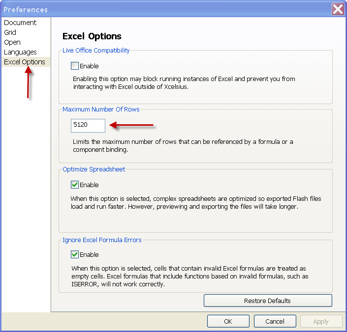
To use all 4,956 rows, you must increase the maximum number of rows in your instance of Xcelsius. This is done by clicking File -> Preferences, then selecting Excel Options in the list of Preferences. From here you can manually adjust the Maximum Number of Rows from the default of 512 to a much greater number. (Use caution when increasing the limit to beyond 5,000 rows).
The screenshot below shows the Maximum Number of Rows being increased to 5120 from 512.

Once the data has been inserted, locate the Candlestick Chart component and List Box then drag them to the report canvas. (Use the Combo Box if you prefer to use it rather than the List Box). Position the components the way you prefer and add a background object or two layered behind the primary components.
Populate the List Box First
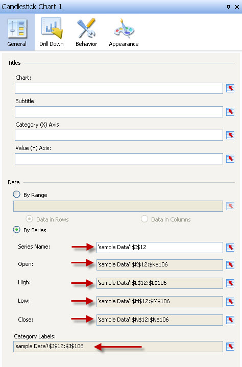
The steps above allow you to grab all the values for a selected date and pass them to the I12:N106 range. We can then bind the Candlestick Chart to these values, allowing the chart to change every time a new date is selected.
Bind the Chart to the Destination Cells of the List Box
Tip: My personal preference is to delete the chart title and subtitle then add Text Labels to the canvas and bind to dynamic titles and subtitles or enter static title values.
The screenshot below shows the Candlestick Chart bindings to the dynamic values in the spreadsheet.

Preview Your Dashboard
Run it, test it, scroll through the dates, and watch the chart change. Once you see the chart in action, you’ll begin to get an idea of how you’d like to modify the colors and how you’d like to modify the layout of your components.
Below are the files used to create this example. Included are: Sample data, XLF model, and SWF file.
Please let me know if you have any questions.
Thank you,
Jim Brogden – jim.brogden@daugherty.com