The popularity of dashboarding has reached an all-time high thanks in large part to SAP BusinessObjects Dashboards (SBOD), formerly known as Xcelsius. This product has helped to push the art of data visualization to the forefront of business intelligence (BI) projects around the world. Because of its highly customizable nature, SBOD dashboards can be designed to fit any visual standard and flexibly deliver data in the most useful formatting styles.
Â
Businesses and corporations of every size need data displayed in meaningful ways and SBOD/Xcelsius delivers this capability gracefully. But in order to achieve success in “dashboardingâ€, certain strategies must be used.
This post describes those strategies and illustrates them in 10 primary building blocks of dashboard design. The blocks are presented in four tiers and are to be used as a guide on your way to designing highly effective and accepted dashboards. The building block strategies represent the order of strategy importance and range from the necessity of complete and accurate data, to the capability of delivering live and personalized content.
Note:
It’s important to note that dashboard projects can vary greatly by industry, function, and audience but they all have one similarity – the requirement to effectively drive change in a clear and understandable format.
Â
Block #1: Complete, Valid and Accurate Data
The first block in the graphic represents the most basic data-delivery fundamental and the most important characteristic of a dashboard – valid and accurate data. If the data being displayed is incorrect or contains errors, any amount of time spent using it will be of no value. Dashboards containing incomplete and inaccurate data are dangerous to an organization and potentially disastrous if crucial decisions are made using erroneous data. This is why every effort must be taken to ensure the accuracy and validity of the content prior to publishing a dashboard into production and delivering it to users.Â
Â
TIP: To ensure that users have a full understanding of the data being presented, a good practice is to provide a pop-up list of definitions for all measures and dimensions in a dashboard. An easy way to include definitions without sacrificing valuable screen real estate is to use the Push Button component as a hyperlink to dynamically display definitions in a Label component. Pairing a background component with the label component allows the definitions to be displayed clearly. This same methodology can also be used for displaying instructions and contact information.
Â
Block #2: Validation of data in Formulas and Permutations
Validation doesn’t end when the raw data has been validated. You will also need to perform validations on any calculation or formula written in the spreadsheet section, values generated by Excel functions, and values captured or generated from data passed by drill-downs. It’s also a good practice to verify that all chart series items are bound to the correct values and labels, and that all selector component labels are bound to a complete list of values without any omissions. These problems can exist when the size of the dataset frequently change or change significantly.
Validation also includes confirming that the correct chart titles are correctly bound to every enabled label in a dashboard. These optional chart titles are listed below.
- Chart Title
- Sub Title
- Horizontal (Category) Axis Title
- Vertical (Value) Axis Title
- Legend
TIP: A single incorrect label or title can change the meaning of an entire dashboard and cause data to be misinterpreted.
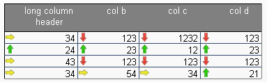
Every chart should be modified to include accurate series names rather than using the default series names. The absence of this detail leaves charts incomplete and can leave users wondering if anything else has been omitted. These settings are pictured in the Figure 2 below.

Other types of chart validations
- Number format on vertical and horizontal labels in charts
- Number format of mouse-over values (when enabled)
- Chart behavior settings appropriately (ignore blank cells)
- Drill down settings (when enabled) – Insertion type, interaction options
- Alert settings (when enabled)
TIP: Always test your dashboards thoroughly before submitting them for user acceptance testing or publishing to production. This gives you the chance to catch mistakes and correct them before they’re found by users. Once users find mistakes, they become less trusting of the data being presented and will begin to look for alternate paths to information.
Â
Block #3: Emphasis on Important Measures
The best approach for getting your message across effectively in a dashboard is to use the most valuable part of the screen to communicate the most important measure, dimension, or block of data. Alternatively, insignificant measures should be treated as such and not given the same amount of coverage as important measures.
Just because you have the data to support twelve charts doesn’t mean that twelve charts should be presented simultaneously and all the same size. Not all metrics carry the same meaning or produce the same amount of impact. For that reason, they should not be given the same amount of space on the screen.
Displaying Important Data
Dashboards should read like a book; from left to right and beginning in the top-left corner. This is the best location for placing selector components that require interaction. These SBOD components include the Accordion Menu, Combo Box, List Box, plus fifteen others.
The primary chart, usually a bar chart, column chart, line chart, or combination chart, should generally be placed within two inches from the top of the screen. Horizontally they should be positioned near the right or left edge then extending beyond the center. This prime location will be the focal point when a dashboard is viewed. A general rule is that supporting or subordinate information should be presented beneath the primary chart, along the right side, or layered in an on-demand or pop-up style.
Primary charts should appear more pronounced than subordinate charts and are normally enhanced with many of the following attributes.
- Color – Bar color, chart area, plot area, axis, label, and title area
- Size – Size of the chart, marker size, horizontal and vertical axis label font size, chart title font type and size
- Background style – Left blank, accompanied by background components, layered above a background created from the Image component
- Chart style – Shaded plot area, chart background hidden/visible, border hidden/visible
TIP: Before beginning development, be sure to spend adequate time with a subject matter expert (SME) to understand the data, expectations, and goals of the dashboard. The best designs come from understanding the data needs of your audience and addressing them with a solution customized from the unique requirements.
Â
Block #4: Clear, Useful, Relevant Results
Presenting data clearly and in a way that engages the audience is a very important quality in dashboard design. The last thing you want to do is confuse users with unclear visualizations or distract them with irrelevant information. This happens when layouts are poorly designed and when insignificant measures are highlighted.
Designs should be clean, professional, consistent, and have a uniformed appearance. Many organizations provide style guides, official color codes for online content and formal design standards. SBOD works well within these standards and provides the capability for developing highly customized and professional dashboards.
The precision of component placement plays an important role in user perception. Even if the data is 100% accurate, a sloppy layout with clashing colors will have a negative impact on users. Overall user confidence and interest will always be low without a precise and professional design. SBOD provides 28 built-in color schemes to help with coordinating the colors in your designs. This is very helpful for non-graphic designers to create beautiful dashboards. Pictured below are the built-in color schemes.

Useful design is when information is effortlessly communicated, easy to understand, and doesn’t frustrate or annoy users. Data should be displayed for a purpose and designed to be interpreted from the user’s perspective.
TIP: Sketch out your designs on paper before you begin development. This will help you work out the organization of components as they’ll appear on the screen. Don’t feel like you have to present everything at one. Use layering to avoid information overload.
Useful dashboards include the following supplemental information.
- Contact information – Provide viewers with an email address to contact the business unit manager or reporting/dashboard administrator
- Version control labeling – Maintaining a version number will provide a reference point for maintenance
- Refresh date – The date/time of last refresh should appear somewhere on the dashboard, usually in the upper right corner.
- Print component – Many users will want to print a specific combination of selections to discuss with other users
Â
Block #5: Intuitive, Engaging, Interactive Design
Possibly one of the most compelling features of SBOD is its ability to engage with users. The animation and entry effects grab the attention of users and the drill down feature allows users to get more details from a chart object. Once users are engaged and interacting with a dashboard, the available choices of clickable objects should be intuitive to the user.Â
Data animation in SBOD is very helpful when interacting with a dashboard because it helps to create context. When toggling through dimensions using selector components, animated changes in charts give users a visual cue of the differences in the values.
For dashboards to be effective, they need to hold the attention of viewers and provide a comfortable user experience. This will go a long way in achieving widespread adoption.
Â
Block #6: Simple Navigation, Drill-downs, Guided Analysis
Simple navigation is key to keeping users from asking, “where do I click?” and “what do I do next?â€. These questions reduce the effectiveness of a dashboard and often leave users frustrated and annoyed. Simple navigation also lends itself to intuitive design.
Â
Dashboards should not be overloaded with choices. Use a reasonable amount of selectors, buttons, and drill options to interact with the data. Careful placement of selector and drill components produce a guided method of analysis and help to tell stories with data and visual components.
Â
A common practice is to display highly summarized data when a dashboard loads to convey the big picture. Enabling drilling and adding hyperlinks to detailed Crystal Reports or Web Intelligence documents can be done for root cause analysis. Dynamic values can also be passed to prompted reports to return related granular information.
Â
Â
Block #7: Scalable, Flexible, Maintainable, and Repeatable
Many dashboards will continue to evolve long after they’ve successfully made it through a test environment, quality assurance (QA), user acceptance testing (UAT), and published into production. Business needs change over time and dashboard data will need to change with it. This is why dashboards should always be designed to adapt to changes with minimal redesign.
Flexibility is definitely one of the strengths of SBOD. Custom dashboards can be designed to fit practically any visual standard and display data in a wide variety of formats. Because of its capability to integrate with add-on components, third-party vendors extend the functionality of SBOD to limitless potential. Companies like Antivia, Centigon Solutions, and Inovista have produced many breakthrough components that easily integrate with SBOD.
For maintainability and repeatability, color coding and documentation should be added to your spreadsheet to identify formulas, source data, destination values, and many other component specific values. By adding comments and using a consistent naming and color coding convention, other developers will have an easier time of understanding and updating your dashboard designs.
Â
Block #8: Fitting Appearance and Acceptable Performance
Appearance plays a vital role in the acceptance and overall effectiveness of dashboards. A user’s general comfort level and trust in the information presented depends largely on presentation. Careless designs with misaligned components, disorganized layouts, and clashing color combinations are quickly rejected. Important business decisions are rarely made from such dashboards. Below are five tips for finding the most appropriate appearance for your client.
- Don’t fear color when designing dashboards. You can make a dramatic and very positive impact with color and create highly professional dashboards with shades other than black, white and gray.
- Don’t fear SBOD components. Single value components such as dials, gauges, progress bars, and sliders are effective and engaging when applied in moderation.
- Consider the law of diminishing returns when customizing designs. The use of color, animation, graphics, and components are all important in dashboard design when used appropriately and moderately.
- Acceptable performance varies depending on the client and amount of data being delivered. Some dashboards only take a couple seconds to load while others may take 20+ seconds. It’s important that viewers are comfortable with the load times from data connections and component interactions.
- Some Excel functions will degrade performance while others have minimum impact. Always use the capabilities of SBOD components whenever possible rather than writing formulas for data interaction.
Block #9: Portable and Mobile Delivery
Portable delivery refers to the capability of emailing a dashboard outside of the network and outside of the SAP BusinessObjects Enterprise InfoView portal. This is done by exporting a dashboard to any of the following formats.
- Flash (SWF)
- HTML
- PDF
- PowerPoint
- Outlook
- Word
For mobile SBOD delivery, a number of tablet devices are available for interacting with dashboards. This includes the Samsung Galaxy Tab and BlackBerry PlayBook.
Â
Block #10: Live, Real-time & Personalized Data
Data is inserted into SBOD dashboards as one of two types – static Excel data or connected data brought in through the Data Manager. The use of static Excel data requires the most amount of hands-on maintenance to update. This is acceptable for monthly or quarterly updates, but if your data needs to be updated more frequently than monthly, a data connection should be used.
Data connections are accessed by launching the Data Manager. The most common connections types are listed below followed by a screenshot of the full list.
- Query as a Web Service
- SAP NetWeaver BW Connection
- Live Office

Another powerful connection type is the BI Web Service feature in Web Intelligence Rich Client XI 3.1 SP2. A WSDL is generated in Web Intelligence with this feature then used by the Query as a Web Service connection type to connect to it.
Dashboards with data connections can still be distributed portably as long users authenticate with the connection source. This keeps data secure and in the hands of valid and authorized users.
Closing Remarks
Use the building blocks in this article as a guide for designing effective dashboards and use them in the most appropriate order for your specific project. Even though the requirements for every dashboard project are different, you will always be successful if you have accurate data, clearly displayed results, and most of all – you’ve helped users solve business problems by providing the capability to see data in meaningful and actionable ways.
Jim Brogden, Senior Consultant
Daugherty Business Solutions | jim.brogden@daugherty.com