In this Post Srinivas Dandamudi of BIR Solutions shows us how to simulate Excel conditional formatting in Xcelsius 2008. The primary component of focus here is the spreadsheet component.
Note: Post edited by Kalyan Verma
If you are trying to use the Spreadsheet component in Xcelsius and expecting it to function like a regular Excel spreadsheet, then I’m afraid you are wrong. Unfortunately Xcelsius doesn’t support Conditional formatting for the Spreadsheet component. However here is an alternative to achieve the same.
I used the rectangle component to simulate this functionality. Try the interactive model below and read the steps. I would recommend you to Download the Source Files at the end of this post and go through the steps while looking at the XLF model.
It’s Interactive:
Steps to get it;
- Create a sample sales data excel file.
- Drag the Spreadsheet table component into the canvas and bind it to the resulted salespersons region values. After binding it to the display data we need to select the ROW and bind the source data and destination to the excel sheet.
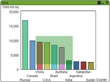
- Drag and drop a Column Chart onto the Canvas and map the spreadsheet table destination to the Chart as Series. On the Chart Properties window, go to the Alerts tab and check the box which says “Enable Alerts”. Then under “Color Order” Select the radio button which says “High values are good”.

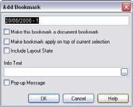
- Then create an Alerts table in your Excel model based on your targets. Check the values by using the formula =IF(G23<30,1,IF(AND(G23>30,G23<70),2,IF(G23>70,3,””))). The resulted table is as follows.

- Carefully place 3 rectangles for each cell on the spreadsheet component. Make sure that they are aligned properly on top of each other. The dimensions of the rectangles should be the same as that of a single cell on the spreadsheet component. Color the rectangles Red, Green and Yellow and set the dynamic visibility appropriately. Display status: 1 for red, 2 yellow and 3 Green.

- The above image shows the interactive with the table and Chart(Alerts)
Download Source Files:

If you have any questions related to the above post, please leave a comment or eMail Srinivas.