Do you need to display stock information in an interactive SAP BusinessObjects Dashboard model? This post shows how to do just that. With as little as two components – the Candlestick Chart and a List Box – you can create and deliver an hour-by-hour and interactive display of stock performance for a selected day.
Download the full-screen version, XLF file, and sample data at the bottom of the post.
It’s customary for stock data to come in a very consistent format. This is good news for Xcelsius and Dashboard designers. Data can be inserted, linked, connected, and bound to your visual components with relative simplicity. Stock data is traditionally available with the following columns:
- Date
- Time
- Open
- High
- Low
- Close
In this post, we’ll create a dashboard by taking the following steps:
- Populate a List Box with trade dates
- Use the values in the Time column as our Horizontal Axis Labels (or Category Labels)
- Chart the values for Open, High, Low, and Close
Stock and commodity trading specialists can analyze the patterns created by a Candlestick chart to make crucial decisions about which products to buy/sell and when to buy/sell them. Patterns in a Candlestick chart can illustrate bullish and bearish trends, trend reversals, indecision of traders, complex stick patterns, and much more. Day traders and long-haul investors alike can employ the centuries old practice of Japanese Candlestick Charting and interpret data patterns in Xcelsius to identify marubozu trends, spinning tops, doji patterns, paper umbrellas, hammers, shooting stars, and many more. And it can all be done within an easy to customize Xcelsius dashboard!
Insert Data
Let’s begin by launching Xcelsius then inserting a spreadsheet with 4,956 rows of trade data.
Note:
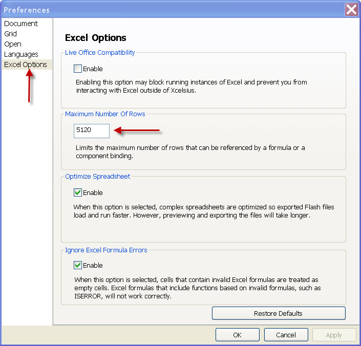
To use all 4,956 rows, you must increase the maximum number of rows in your instance of Xcelsius. This is done by clicking File -> Preferences, then selecting Excel Options in the list of Preferences. From here you can manually adjust the Maximum Number of Rows from the default of 512 to a much greater number. (Use caution when increasing the limit to beyond 5,000 rows).
The screenshot below shows the Maximum Number of Rows being increased to 5120 from 512.

Once the data has been inserted, locate the Candlestick Chart component and List Box then drag them to the report canvas. (Use the Combo Box if you prefer to use it rather than the List Box). Position the components the way you prefer and add a background object or two layered behind the primary components.
Populate the List Box First
- Select the List Box
- Bind the labels to the entire DATE column. (All 4,956 rows)
- Change the Insertion Type to Filtered Rows
- Source Data: Select the entire block of data – (A12:F4967) as Source Data
- Destination: Select a range that will hold all the values of a unique date (and a few extra rows – just in case). In my example, I set the Destination to (I12:N106).
The steps above allow you to grab all the values for a selected date and pass them to the I12:N106 range. We can then bind the Candlestick Chart to these values, allowing the chart to change every time a new date is selected.
Bind the Chart to the Destination Cells of the List Box
- Begin by Selecting the Candlestick Chart
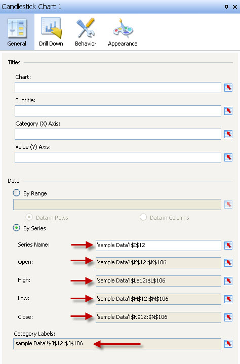
- In the Properties tab, click the By Series option under Data
- Bind the Series Name to the first date value. (In this example, it’s I12)
- Bind the Open values to the column of Open data. (Column K)
- Bind the High values to the column of High data. (Column L)
- Bind the Low values to the column of Low data. (Column M)
- Bind the Close values to the column of Close data. (Column N)
Tip: My personal preference is to delete the chart title and subtitle then add Text Labels to the canvas and bind to dynamic titles and subtitles or enter static title values.
The screenshot below shows the Candlestick Chart bindings to the dynamic values in the spreadsheet.

Preview Your Dashboard
Run it, test it, scroll through the dates, and watch the chart change. Once you see the chart in action, you’ll begin to get an idea of how you’d like to modify the colors and how you’d like to modify the layout of your components.
Below are the files used to create this example. Included are: Sample data, XLF model, and SWF file.
Please let me know if you have any questions.
Thank you,
Jim Brogden – jim.brogden@daugherty.com


Pingback: Tweets that mention Interactive Candlestick Charting with Xcelsius – MyXcelsius.Com -- Topsy.com()