Population pyramids aren’t just for Excel anymore. In just a few minutes, you can have a great looking Xcelsius chart that isn’t commonly seen in Xcelsius.
UPDATED 2/7/2012
While the instructions below show how to build the population pyramid using a stacked bar, the better example that I have found is to use negative numbers for the male values. Then you use a custom format that looks like this: 0.0%_);0.0% and that will make both the axis and the mouseover values all appear as positive. Please take a look at the revised XLF below.
For more information, visit: <>Data-Ink.com
I’ve seen a number of population pyramids in Excel and wanted to start working on some templates in Xcelsius. The following is my first attempt at putting together a very clean example that could be expanded upon (and animated for data over time).
With a couple of hours of trial and error, I believe that I can tell you how to make your own Population Pyramid in a few minutes. To get the best effect, I recommend using my customized theme at www.data-ink.com/themes.html or use the iTheme (but I do warn that your form components won’t look as good).
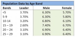
Next, you will want to make sure that you have some population data by age and gender available. Here is some sample Census Data.
The end product will be a combination of two graph types. A stacked bar chart for the pyramid and a column chart for the labels and optional gridlines.
Now here are the easy steps to follow to create your own visualization:
Step 1: Create Graph ScalesÂ
To determine the width to be mirrored on each side, we need to calculate the maximum percentage in the table [=Max(Range)] and then rounded up to the nearest 5% or 10% interval. I have experimented with a formula to automatically round up which is included in the sample file.Â
The stacked bar chart will have a scale of zero to the max scale, which is double the actual scale. Â
Step 2: Setup the dataÂ
You will need to paste your data in Xcelsius in two columns (male/female) with a row for each age-band. You will then create a new column between the labels and the data to shape the chart. The “leader” column is calculated as the Scale from above – the male population percentage for each line.Â
  Step 3: Insert a Stacked Bar Chart Linked to the Data Above
Make sure to turn off the horizontal access and the gridlines. The axis minimum needs to be zero, and the maximum set to the “max scale.” Unfortunately mouseover values should be disabled or the displayed values may be confusing.
Step 4: Recolor the Series
Change the “leader” series to white and set the others to your desired colors.
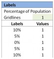
Step 5: Add a Column Chart for the Label
I worked on some Excel logic to automatically scale the labels in the attached file. This makes it much easier to make sure that the scale of both graphs change together if you loading dynamic data. Also, you need to leave some room between the pyramid and the column chart’s horizontal access in case you end up with a larger number of categories and the text flips to a vertical position.Â
It is import to overlay the chart just right to make the axis line up to the zero category. Additionally, you want to set the maximum value on the column chart to 1. This allows you to enter 1 for each category to add gridlines, or set all the values to zero to leave it blank. When making my gridlines, I made the series marker width a mid-tone gray with 80% transparency and a width of 1.
Finishing Touches:
Don’t forget to add labels or graphics to identify the male vs. female sides. Here are some other ideas that I’ve had…
- Toggle to add / remove gridlines. Just make sure to turn off the chart animation on the column chart.
- Add a near invisible bar chart or transparent excel table selector to allow the user to interact or drill down into each age band as a whole.
- Incorporate a play selector to show population changes over time.
If you have any other ideas, I’d love to hear them!
Josh Tapley
josh@data-ink.com


Pingback: Tweets that mention Population Pyramids using Xcelsius – MyXcelsius.Com -- Topsy.com()
Pingback: Population Pyramid Reposted « Data-Ink.com()