This post demonstrates a simple way to create a drop line chart using Xcelius’s out of the box combination chart. This is a fun chart great for mixing up your routine presentation layer.
What are drop lines?
Simply put, drop lines are lines that extend from a data point down (or up) to the horizontal axis. Drop lines help the viewer visualize the exact value of each point along the horizontal axis.
How to create:
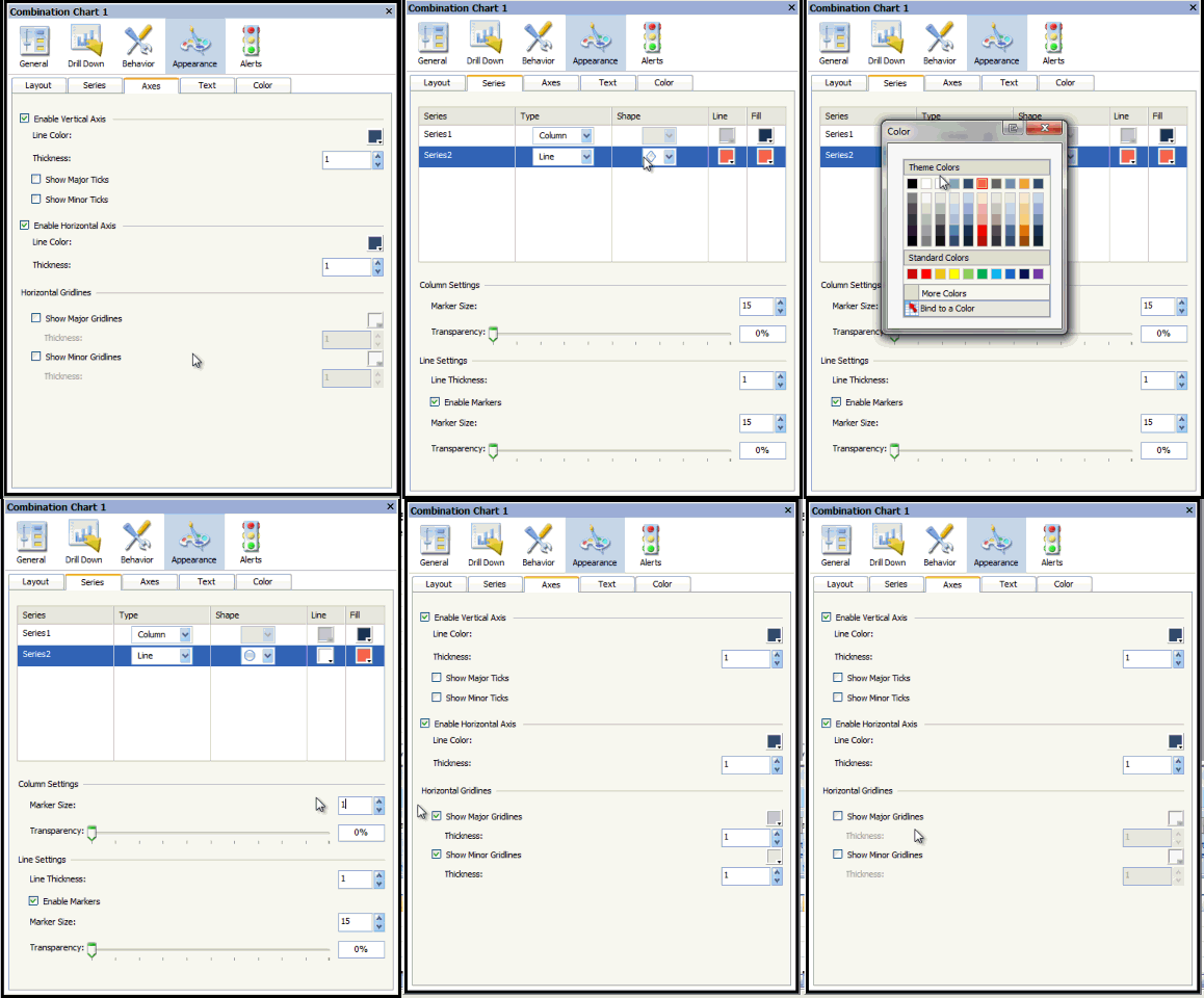
1. Add a combination chart to your canvas
2. Add two series
3. Select the same range of data for both series (one line series and one bar series)
4. Remove the legend by going to the “Text” tab under the “Appearance” properties
5. Remove the major and minor horizontal grid lines (leave major grid lines if expected to have negative numbers) found on the “Axes” tab under the “Appearance” properties.
6. On the “Series” tab under the “Appearance” properties change the line shape to a circle, change the line color to match the chart background, and change the marker size to 1 under the column settings.
There you have it.
Let me know if you have any questions.


