Dashboard Developers Donating Time to Help Charities

Xcelsius Reportapalooza Challenge 4On Monday October 18th, Reportapalooza introduced the entries to it’s fourth installment of the “virtual” reality show style campaign in a challenge dubbed “Dash for Charity”. In this challenge, the experts were paired with a charity to design and develop a visual model using SAP BusinessObjects Dashboards (Xcelsius). The goal of each dashboard was to help promote and spread awareness for each expert’s chosen charity.

For me, this has been the highlight of Reportapalooza. And I’ve been looking forward to this challenge since the beginning of the campaign. I love the idea of donating my time and energies on a project that could potentially make a difference in someone’s life. Hopefully all of our dashboards will be used to help the people that actually “help people” – long after the campaign is over.

Continue reading →

How to create a drop line chart in Xcelsius

This post demonstrates a simple way to create a drop line chart using Xcelius’s out of the box combination chart. This is a fun chart great for mixing up your routine presentation layer.

What are drop lines?

Simply put, drop lines are lines that extend from a data point down (or up) to the horizontal axis. Drop lines help the viewer visualize the exact value of each point along the horizontal axis.

How to create:

1.  Add a combination chart to your canvas
2.  Add two series
3.  Select the same range of data for both series (one line series and one bar series)
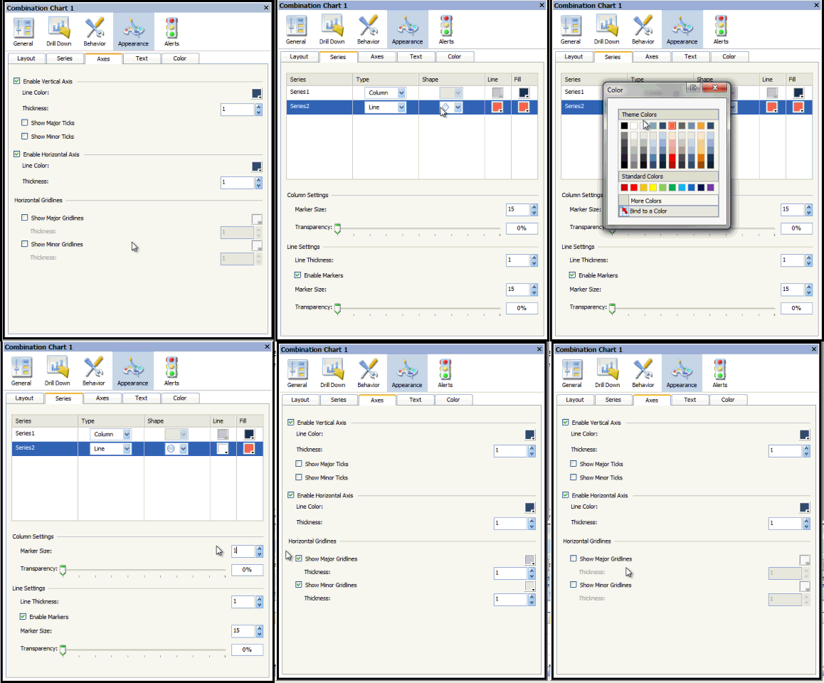
4. Remove the legend by going to the “Text” tab under the “Appearance” properties
5. Remove the major and minor horizontal grid lines (leave major grid lines if expected to have negative numbers) found on the “Axes” tab under the “Appearance” properties.

6.  On the “Series” tab under the “Appearance” properties change the line shape to a circle, change the line color to match the chart background, and change the marker size to 1 under the column settings.

There you have it.

Let me know if you have any questions.

Configuring Sparkline Charts in Xcelsius

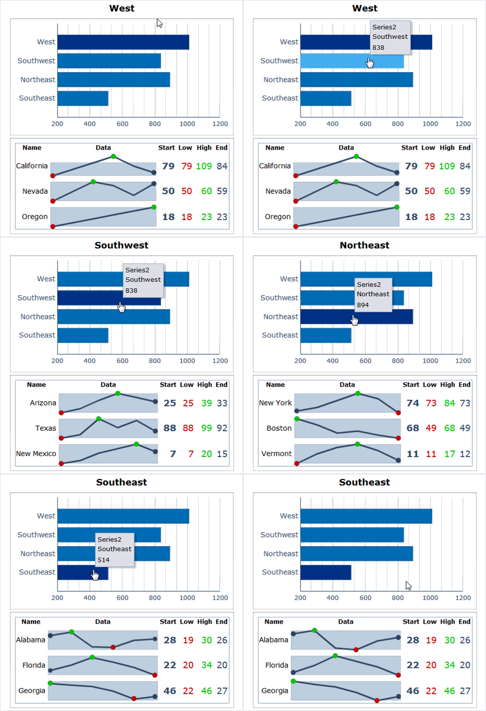
Are you using the latest Xcelsius service pack? If not, you may be missing out on a couple very useful charting components. By installing SP3 for Xcelsius, you’ll have the opportunity to use the following new chart components – Horizontal Bullet Chart, Vertical Bullet Chart, and Sparkline Chart. This blog post will focus on the Sparkline chart.

xcelsius-sparkline-chart

Continue reading →

How to implement an expiration date in an Xcelisus dashboard?

Here is an Xcelsius/Excel trick that allows you, the developer, to set a validity period on a dashboard. This is great for sharing demos or giving a potential client an evaluation period.

1. Setup your Excel file as follows

Continue reading →

Video: SAP Augmented Reality Explorer Prototype

Here is a short demo on SAP Augmented Reality Explorer Prototype by Timo Elliot. Timo explains how the Augmented Reality Explorer allows people to easily access information simply by pointing with the cell phone using the GPS location and the compass. I’m embedding the video here, but you can find all the details about the project on Timo’s blog.