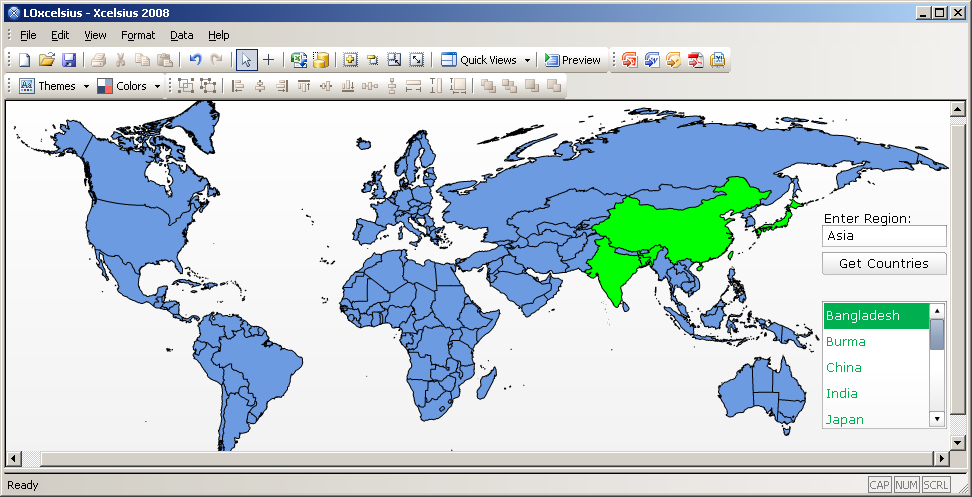
Part I of this series explains “What are Heap Maps?”. In Part II, the focus is on “Why to Use them?”
Heat maps empower executives, managers and front-line personnel by directly addressing the challenges they face in processing and understanding the data they deal with daily, challenges that arise from powerful trends that are transforming how organizations function.
The Explosion of Data
There is an exploding volume of data to be processed:Â we have more ways to gather data, more sources to gather data from, and more ways to combine that data to generate still more data than ever before. As a result, most organizations find themselves buried in information. The challenge is not finding data, it is learning to extract that which is truly valuable
The Proliferation of Complexity
Complexity is rising just as fast as volume, reflecting a surge in the complexity of what we seek to describe. For example, there has been a tremendous proliferation of new business models – how businesses interact with their customers or partners or combine elements of their supply chains – and fundamental shifts in requirements for marketing, with dramatically narrower segmentation of customers based on increasing amounts of information. This complexity means that traditional measures are often meaningless. Businesses must learn to dive much deeper into their data to understand what is going on.
There is an exploding volume of data to be processed: we have more ways to gather data, more sources to gather data from, and more ways to combine that data to generate still more data than ever before. As a result, most organizations find themselves buried in information. The challenge is not finding data, it is learning to extract that which is truly valuable
The Acceleration of Change
Change today means that if you’re not ready now, you’ve already missed your chance. Almost everything that a business does is accelerating. Simply to keep up, businesses must continuously decrease the time it needs to respond to a supply glitch, or to a new market opportunity, to develop a new product, or to counter a competitor’s move. In effect, the time available to leverage the value of any information is continually shrinking.
The Value of Collaboration
Being connected is central to being effective. Outsourcing of growing numbers of activities to external partners, supply chain innovation, and globalization all lead to increasing collaboration between groups within an organization, across organizations, across locations, and across cultures. Collaboration makes good communication crucial: if communication is not consistently effective, clear and timely, collaboration breaks down and with it a key factor in business success.
Summary
To stay ahead of these trends, businesses need tools that can provide an edge in handling the increasing volume and complexity of information, in communicating information and analysis effectively, and to do all of it quickly. That is precisely the kind of edge that heat maps provide.


 Often many components in Xcelsius are not used to their full potential. This may be because of the generic business requirements or lack of developers knowledge on the components repository in Xcelsius 2008. One such component is the Trend Analyzer. The Trend Analyzer combines data analysis and visualization. The component analyzes the data selection and provides an additional data series that can be plotted to display a trend line. The Trend Analyzer component does not display in the visualization. You can find the Trend Analyzer under the Other Category of the Components Browser in design mode of Xcelsius 2008. If used appropriately, this component can be a powerful trick to show trends within Xcelsius based dashboards.