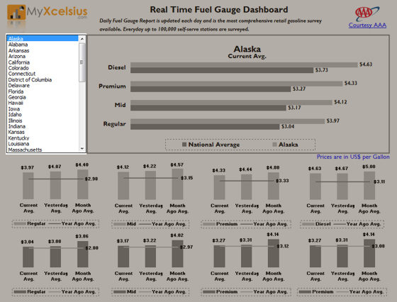
In one of the earlier posts about “Historical stock quote Price using Web Query and MS Excel 2003” I wrote about the use of Excel Web Queries to create Live Excel utilities. There was a great response to the post. So, I decided to explore Web Queries and built some more with the same methods. This time Dashboards with live web data. Also, one of the main reasons is that, I have started reading “Information Dashboard Design” by Stephen Few and found it very informative and a great resource for Dashboard developers. I started implementing the design principles mentioned by Mr. Few and found them very effective. This is my first Excel Dashboard after I started reading the book. I also tried to mimic microcharts in Xcelsius in one of my earlier dashboards called “Airline Executive Dashboard”. You can find it in the showcase page.
Back to the Fuel Gauge Dashboard. Below is the information on development, different sections and Usage of the dashboard.
Design:
I used Excel Web Queries connected to AAA data. The data is being pulled from http://www.fuelgaugereport.com/. The IQY files were modified to pick up parameters from certain cells and those cells were dynamically changed by the List Box input. So when the user clicks on a state from the list box, it inserts the state value in the destination cell which is linked to the parameter of the Web Query. The web query is set to refresh when there is a change in the parameter cell.
The web query results were mapped to certain cells which make up the source data for the charts. I had to use Lookups since the web query had a state abbreviation in it.
I implemented 2 principles that I’ve learned from Mr. Few’s book.
- Design dashboards for the color blind: Apart from the logos and the URLs, the only color used in the dashboard is Gray. I used 2 shades of gray since I was comparing National and State prices. The darker shade represents National and the lighter is for the State prices.
- Design dashboards to fit in one page: I personally feel, that dashboards should never be scrollable. They should be used as “At a glance” Decision making tools, rather than scrolling up and down to compare metrics. This dashboards fits perfectly into a A4 size paper when taken a print in the landscape mode.
Different Sections of the Dashboard:
- Header:

- State List Box:

- Current Average Price Comparison, State [vs] National :

- State Average Prices:

- National Average Prices:

How to use the Dashboard:
- Download the Dashboard
- Open the XLS file and Click on “Enable Automatic Refresh” if prompted.
- Use the List Box to select a state. Make sure that you click on the text. Sometimes if you click in the blank space next to the State name, it might not get selected.
- Wait for the data to be loaded before clicking on the next state. Since the dashboard is connected to live data on the web, it takes some time to load depending on your internet connection speed. Look for the rotating globe icon on the bottom right of the excel. If that is spinning, then the dashboard is trying to get information from the Web.
Wrap up:
Web Query is a great feature to have in Microsoft Excel. Personally I feel that the above dashboard is a very simple one. Web Queries can be used to create more complex live dashboards. Watch out for more from MyXcelsius.com.


Pingback: Biggest Halloween » Blog Archive » Real Time Fuel Gauge Dashboard using Excel Web Query()
Pingback: Dashboard Zone » Fuel Gauge Dashboard using Excel Web Query()
Pingback: Real Time Excel Dashboard Tracks Gas Prices()
Pingback: Excel Links of the Week - What the heck happened to photographic fridays edition | Pointy Haired Dilbert - Chandoo.org()