Do you need to display the Linear Regression or Logorithmic Regression of data trends in an Xcelsius dashboard but don’t know how to write the required formulas? If so, you’ll be extremely pleased to know how easily these regression types can be created in Xcelsius. And all without having to figure out which formula to use, how to get the syntax perfect, or which values should be plugged into which variables. Just bind the component to two rows (data source and destination cells) in your spreadsheed and it’s done!
By using the Trend Analyzer component, you’ll be able to add up to five different types of regression trends to your dashboards – in seconds. This post will walk you through the steps of adding regression trends to a dashboard and discuss several other details of the component.
To save time, I’ll add the Trend Analyzer component to an existing Xcelsius model before describing the features, functionality, and properties. The screenshot below shows how to locate it in the component browser as it appears in the Other category.
* One thing to note about this component is that it’s not visible during runtime. You don’t have to worry with moving it to a bottom layer in your dashboard because it can only been seen while in development.

Â
Modifying the Trend Analyzer Properties
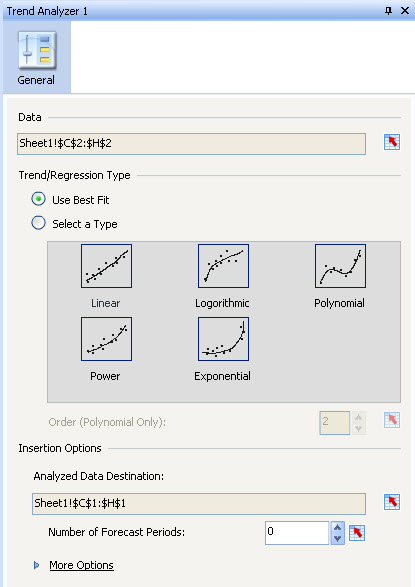
Once you’ve added the Trend Analyzer component to your dashboard canvas, select the component to view it’s properties. The properties are separated into three sections and pictured in the screenshot below.
- Data
- Trend/Regression Type
- Insertion Options

Properties: Step by Step
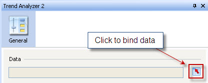
1. Data: The Data section is very important because this is where you will map (or bind) to the data that will be converted to the specified regression type. Just click the standard mapping icon to select the data to be analyzed. See screenshot below.
2. Trend/Regression Type: Here you have the option of selecting either Use Best Fit or Select a Type. The default selection is Select a Type and the default selection type is Linear. The available selection types are:
- Linear
- Logorithmic
- Polynomial
- Power
- Exponential
3. Analyzed Data Destination: Here is where you’ll map to a blank area in your spreadsheet that’ll be used to store the analyzed data fed in from the Data section. Be sure to color-code and label your Analyzed Data Destination cells or it will be difficult (if not impossible) to locate them later.
More Options
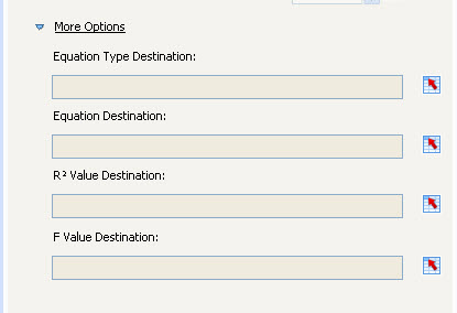
Additionally, you can click the underlined supplemental section called More Options to display a list of advanced or formula specific values. Use this section to add addional labeling to your dashboard if the formula values are important to your users.
These options include the following:
- Equation Type Destination
- Equation Destination
- R2 Value Destination
- F Value Destination
These properties are pictured below.
Â
Putting the Trend Analyzer Component Into Action
It’s time to bind our component to some data values and see what it can do.
- Step 1: Bind to data. I selected cells C2:H2 as the data source for the component.
- Step 2: Select a Regression Type. I selected Use Best Fit.
- Step 3: Define your Analyzed Data Destination. This step is used to bind to blank rows in your spreadsheet. It’s important to note that the number of cells selected in this step should match the number of cell selected in Step 1. I selected cells C1:H1.
- Step 4: Highlight and label your destination cells. In this example, cells C1:H1.
To see the regression value displayed, add a new series to a chart then bind to cells C1:H1.
Â
Displaying the Variables
Â
Follow these steps to display the variables used in creating the regression.
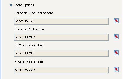
- Step 1: Expand the More Options label
- Step 2: Bind to a single blank cell in your spreadsheet for each of the four options
- Step 3: Color code and label your spreadsheet
- Step 4: Add Label components to your dashboard canvas and map to the cells used in Step 2.
Putting it All Together
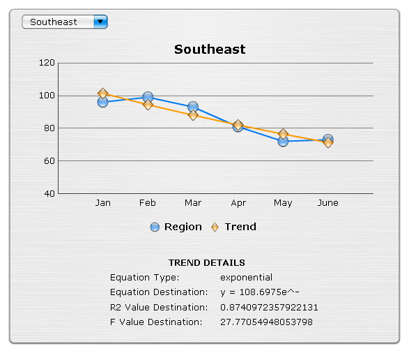
The next screenshot shows how a Regression series can be added to a chart and trend details displayed at the bottom of the screen. The drop-down was added to show that Trend/Regression values can be calculated dynamically and modified by other components in the dashboard. This simple example passes the Combo Box selection to a cell in the spreadsheet and VLOOKUP formulas are used in cells C2:H2 to determine the value to be charted. The formulas in cell C2:H2 are listed below.
- C2 =VLOOKUP($B$2,$A$19:$O$22,3,FALSE)
- D2 =VLOOKUP($B$2,$A$19:$O$22,4,FALSE)
- E2 =VLOOKUP($B$2,$A$19:$O$22,5,FALSE)
- F2 =VLOOKUP($B$2,$A$19:$O$22,6,FALSE)
- G2 =VLOOKUP($B$2,$A$19:$O$22,7,FALSE)
- H2 =VLOOKUP($B$2,$A$19:$O$22,8,FALSE)
If you recall, step 1 above (in Putting the Trend Analyzer Component Into Action), C2:H2 is the data source for our Trend Analyzer component. This means that the values in C1:H1 will always change when the contents of B2 is changed. Not coincidentally, cell B2 is the destination cell of my Combo Box.
Below is a screenshot of a simple dashboard using Trend Regression and displaying trend details.
Please feel free to contact me with any questions.
See the dashboard in action: Interactive and Dynamic Regression Trending with Details
Download the XLF file: Regression Trending XLF
Thank you,
Jim Brogden
jim.brogden@daugherty.com

Pingback: Tweets that mention Adding Regression Trends to a Dashboard – MyXcelsius.Com -- Topsy.com()