This is a three part series on Heat Maps. Part I is all about “What are Heat Maps?”, Part II: “Why Use Them” and Part III explains “How to Read One”
What is a Heat Map?
A heat map is a visualization of data which uses color to represent data values in a two-dimensional image. There are many different types of heat maps used in different disciplines, each referred to by the term “heat map”, even though they use different visualization techniques. Most heat maps use mapping techniques to represent their data rather than charting and graphing techniques, thus providing unique views of data not available in charts and graphs.
This article examines the most common types of heat maps and when each is used. The type of heat map used by Lab Escape’s Heat Map Explorer and Enterprise Tree Map SDK products is a tree map, which is the most common type of heat map in the business world.
1. Tree Maps

Tree maps, or “treemaps”, are the most common type of heat map.
Used to represent large or complex data sets in applications ranging from stock market analysis, risk management, project portfolio analysis, market share analysis and network management, tree maps were invented by Ben Shneiderman at the University of Maryland in 1990.
Tree maps maps give you an edge in identifying critical issues, allocating resources, finding trends or relationships and creating transparency in large or complex data sets. Tree maps do this by showing the line item details of a dataset in a way that also provides a visual summary overview, so that trends, anomalies, distributions and relationship can be seen in context and at multiple levels at once.
Tree maps look like a series of nested rectangles, where each rectangle represents an item in a set of data. Data values can be mapped to both the size and the color of each rectangle, allowing users to analyze two variables at once. Grouping rectangles together provides an intuitive way to visually analyze categorized, segmented or multi-dimensional data.
2. Geographic Maps

Geographic maps are one of the oldest types of heat maps, though only recently has the term “heat map” started to be applied to these visualizations.
Used to represent location-based data, geographic heat maps highlight trends, anomalies and distributions across a geographic area in application rangings from market share analysis, risk distribution analysis, and real estate market analysis.
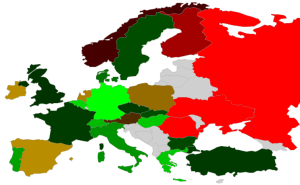
Geographic heat maps use one of two different heat map techniques to represent data. The first takes each entity on the map, such as a country or state, and colors that entity with a single color which represents the data value for that entity (see image above). The second technique uses a topographic mapping approach similar to click maps and colorizes areas of activity, such as rainfall, as clouds of color on the map.
Geographic heat maps are an excellent way to identify geographic trends and anomalies in data. Additional, spatial maps, which are closely related to geographic maps, can be used to visualize any data which is location-specific, such as mapping where products are sold in a retail store or the usage patterns of machines on a factory floor.
3. Microarray Maps

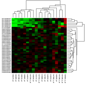
Microarray maps are a special type of heat map used to highlight gene expression in molecular biology. Microarray heat maps use a colored grid linked by a dendrogram (a tree diagram) to hierarchically cluster genes. Generally, the rows of a microarray heat map represent genes with each column of that row representing a different sample. Each cell is colorized based on the level of expression of that gene in that sample. Microarray heat maps help you find groups of genes which behave similarly across a set of experiments.
Summary
There are many different types of heat maps. This article listed just a few of the most common types. Heat maps also can be created using self-organizing maps, business process diagrams and other types of visualizations. What all heat maps have in common, however, is the powerful use of color to communicate underlying data values which would be much harder to understand if presented numerically.


Pingback: Heat Maps: Part III - How to Read One? | Visual Data Analytics()