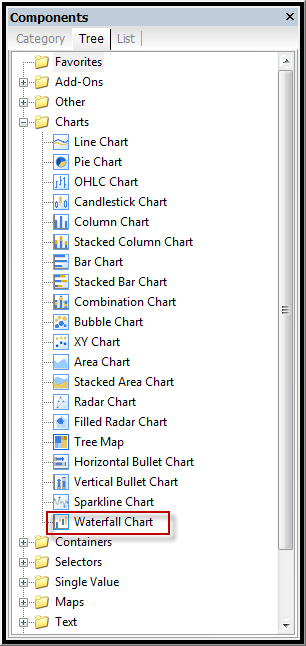
One of the new features of the latest service pack SP4 is the Waterfall chart. Until now, we have had to do workarounds or purchase third party addons to achieve a waterfall chart.
What is a Waterfall Chart?
A waterfall chart is a form of data visualization which
helps in determining the cumulative effect of sequentially introduced positive
or negative values.
Overview
The waterfall chart is normally used for understanding how
an initial value is affected by a series of intermediate positive or negative
values. Usually the initial and the final values are represented by whole
columns, while the intermediate values are denoted by floating columns. The
columns are color coded for distinguishing between positive and negative
values.
Applications of Waterfall Chart
A waterfall chart can be used for analytical purposes,
especially for understanding or explaining the gradual transition in the
quantitative value of an entity which is subjected to increment or decrement.
For instance, it can be used for visualizing the profit/loss which results from
summation of revenue coming in from different sources and subsequent decrement
of all expenses.
Waterfall charts can be used for various types of quantitative analysis ranging from inventory analysis to performance analysis.
How to construct
1. Select the Waterfall Chart from the list of
chart components
2. On the General tab of the chart properties
select your values and labels
3. Formatting is the same as any other chart in
Xcelisus
4. On the Series tab under Appearance you can
adjust the following color options
- Initial Value Color
- Final Value Color
- Positive Value Color
- Negative Value Color
There you have it – Feel free to downlaod the source files.
* Info copied from Wikipedia


Pingback: Xcelsius: Service Pack 4 bringt Wasserfalldiagramm | graphomate blog()