Are you using the latest Xcelsius service pack? If not, you may be missing out on a couple very useful charting components. By installing SP3 for Xcelsius, you’ll have the opportunity to use the following new chart components – Horizontal Bullet Chart, Vertical Bullet Chart, and Sparkline Chart. This blog post will focus on the Sparkline chart.
Background on Sparkline Charts
Sparklines were introduced by Edward Tufte and he describes the component as being useful for displaying information that is “data-intense, design-simple, and with word-sized graphics”. A common application of the Sparkline chart is to present stock prices across a given period of time. If the user knows the time frame (such as day, month, year) it becomes redundant to continually display a horizontal access label showing this information. By continuing to print Jan – Dec along the horizontal label, valuable “screen-estate” is being used to display known information. By removing the label values, a dashboard, report, or user-interface can present more information to the user and in the most effective ways.
Sparklines in Xcelsius
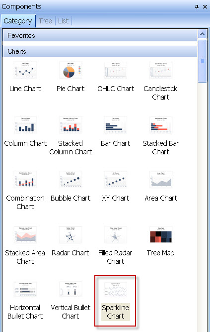
The Sparkline component in Xcelsius provides all of the known appearance characteristics of a Sparkline chart and then some. Let’s take a look at the customizable features available. Begin by locating the Sparkline chart in the list of available chart components.
Drag the Sparkline Chart component to the dashboard canvas to begin using it. The image below shows how the component will appear before binding it to data or modifying the configurations.
Setting Sparkline Properties
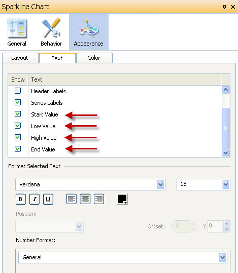
Select the chart then view the component properties. Properties can be adjusted in three categories: General, Behavior, and Appearance. Click the Appearance tab, then click the Text tab, and scroll down to the bottom of the list.
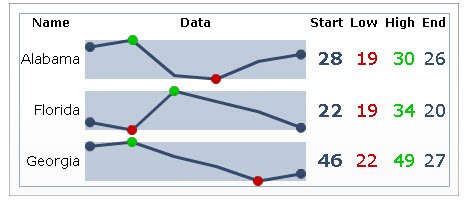
Notice that Start Value, Low Value, High Value, and End Value can be selected individually to be displayed along with the Sparkline chart. These settings allow the checked values be added to the right end (by default) or left end (if modified) of the chart.
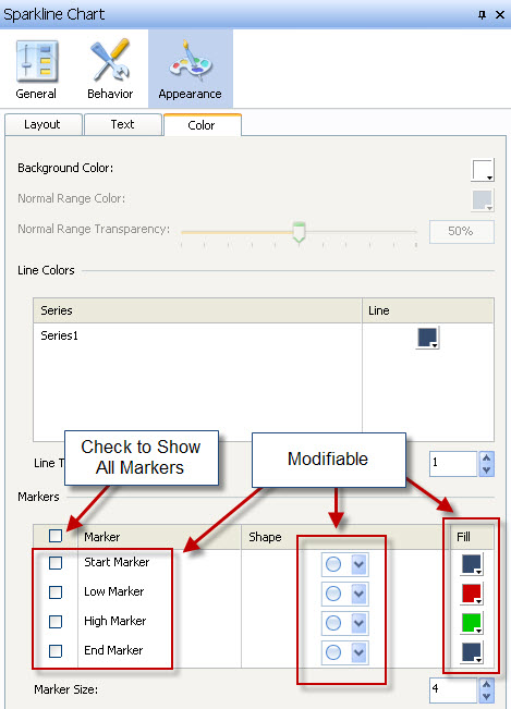
When selected, you can also modify the color of the values and display a marker on the chart. This is accomplished by clicking the Appearance tab then clicking the color tab.
Finished Product
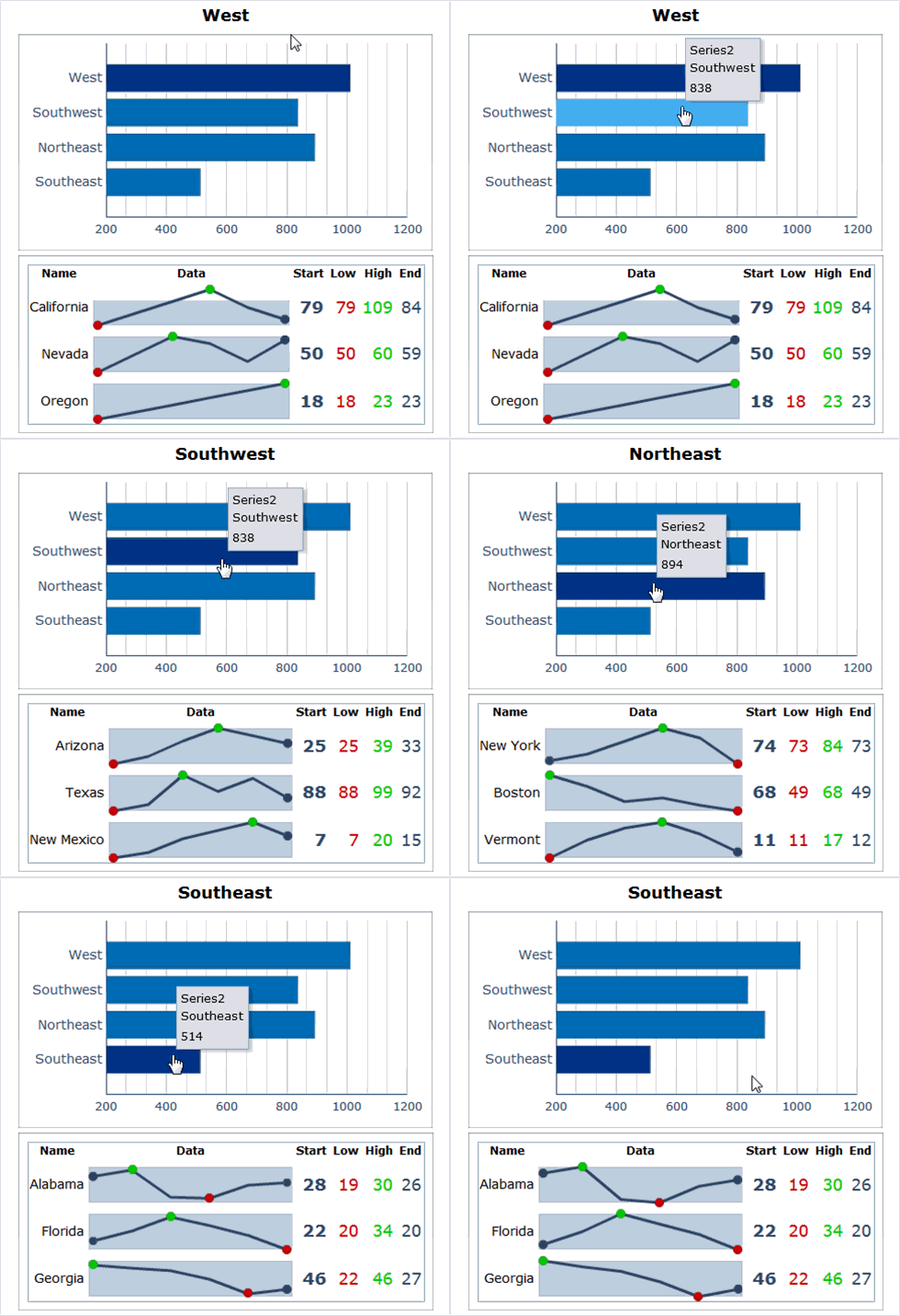
Pictured below is a screen-shot of three Sparkline charts with values added and markers displayed and a second screen shot shows the Sparkline charts without the chart values. The data represents 6 months of information and is easy to decipher at a glance.
Let me know if you have any questions.
Thank you,
Jim Brogden
jim.brogden@daugherty.com




Pingback: Tweets that mention Configuring Sparkline Charts in Xcelsius – MyXcelsius.Com -- Topsy.com()